• Sign In
  • ACDA.org
  • Skip to primary navigation
  • Skip to main content
  • Skip to primary sidebar
  • Skip to footer
ChoralNet

ChoralNet

The professional networking site for the global online choral community.

  • Home
  • Blog
  • ACDA News
  • Events
  • Community
    • Announcements
    • Classifieds

You are here: Home / Others / Best choir logos

Best choir logos

October 13, 2010 by Allen H Simon Leave a Comment


We've all seen lots of bad choir logos, and lots of unimaginative ones which put the choir name on a staff, or substitute a treble clef for a G (or worse, S). 
 
But recently I've run across a few good ones, which I thought I'd highlight here. This isn't the result of any systematic research, just a few minutes on Google Images. Click each one for a bigger version.
 
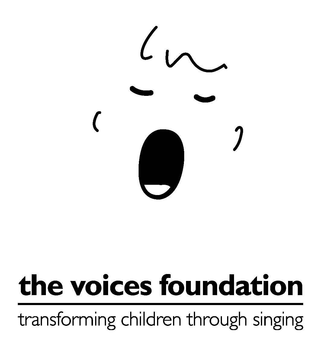
This one got featured on a design website:
 
and of course:
 
 
Feel free to nominate your own "bests" in comments. Rules: don't include the logo of a choir you direct, sing in, or are otherwise part of. And it has to be the logo of a choir, not a church, university, TV show, etc. This isn't a serious competition, anyway; it's just for fun.

Filed Under: Others

Reader Interactions

Leave a Reply Cancel reply

You must be logged in to post a comment.

  • ACDA.org
  • The ChoralNet Daily Newsletter
Association of Lutheran Church Musicians


Advertise on ChoralNet

Footer

Connect with us!

  • Home
  • About
  • Help
  • Contact Us
  • ACDA.org

Recent Blogs

  • Choral Ethics: Ruminations of an Old Ballerina
  • Choral Ethics: Be Yourself, No Regrets
  • ChoralEd, the Audio Signal Chain
  • The Conductor as Yogi: Leading Towards Whole
  • Choral Ethics: Out For the Same Audience

American Choral Directors Association

PO Box 1705
Oklahoma City, Oklahoma
73101-1705

© 2026 American Choral Directors Association. All rights reserved.
Terms of Use | Privacy Policy